|
|
|
|
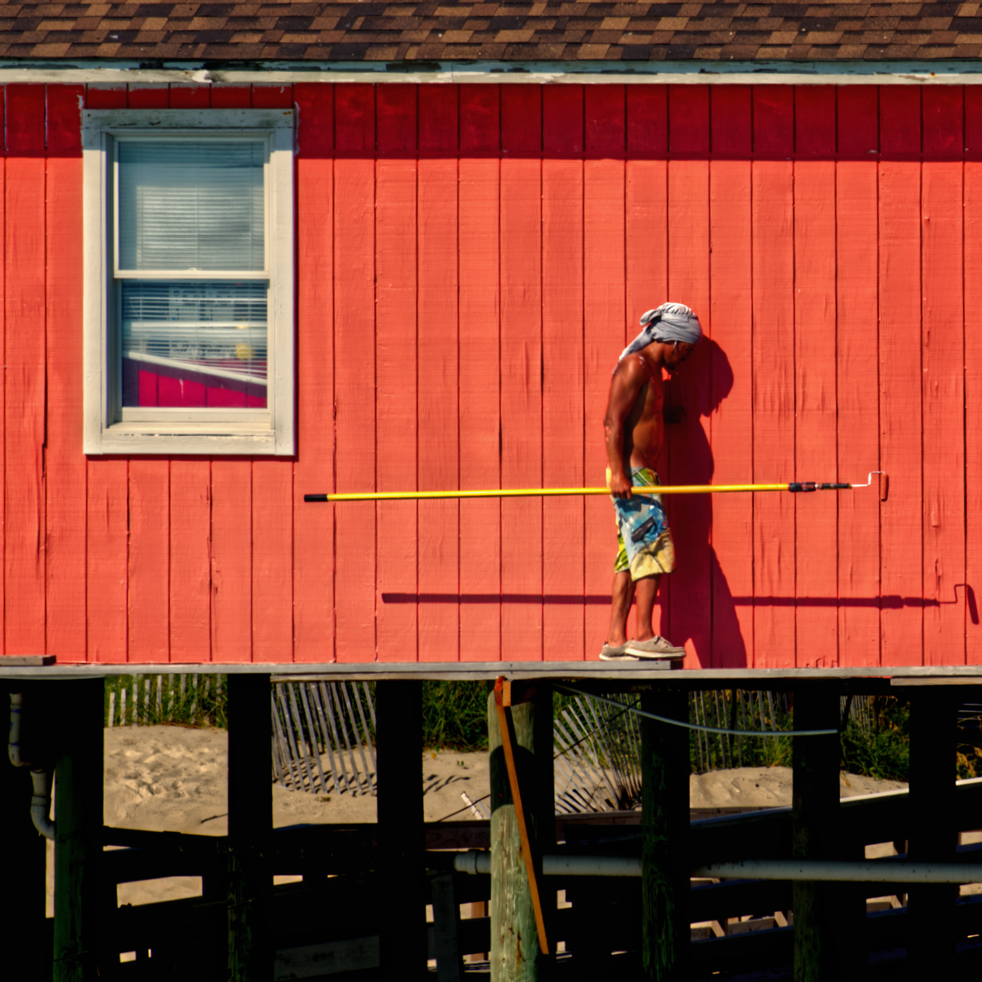
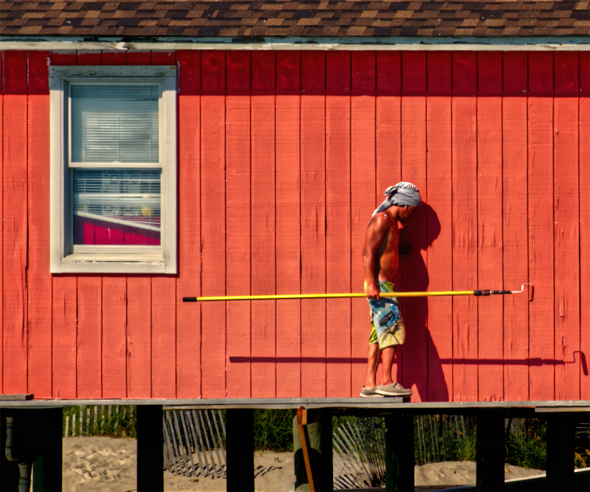
I happened to be fishing about a month ago on a pier located in the Outer Banks of North Carolina and saw this person painting the outside of the pier bait shop. He is actually about twenty-five feet in the air, at the level of the fishing pier. He didn't seem to care much about safety and just painted away. The funny thing is that he kept his paint tray about 15 feet away on a side area of the pier and had to keep waliking back and forth on the small plank walkway he had created. From my standpoint this was a risky venture.
1/500
F11
ISO 200
FL 155
Affinity Photo
I thought this might prove to be an interesting street or documentary type image, so I took my best shot (no pun intended). I was interested in what the critics might say regarding thee photo and ways to improve it.
Thanks in advance for your input.
Best regards, Patrick
Patrick,
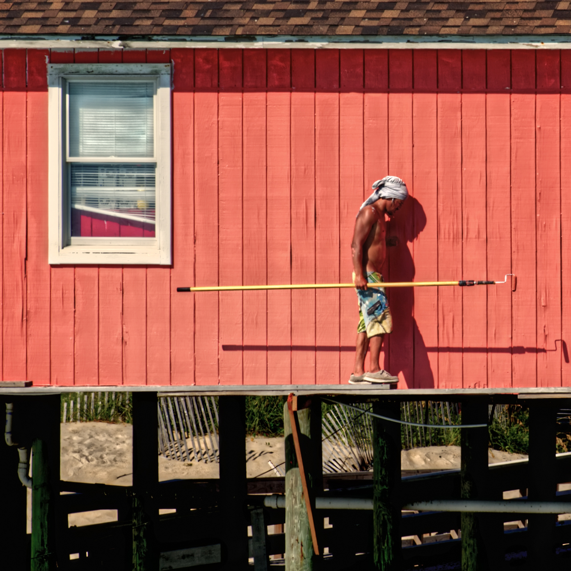
I hope I may give you an honest comment and of course this is my personal vision for what it is. Two remarks, it should be nice if there was more action of the man to make this image more interesting and second below you have too much. A part is there a little bit distracting or takes too much attentention. My suggestions for improvements are. Make a 12/10 crop in a way you lose below the half of the pillars. The pillars are important to see the man is walking on planks. But with the crop all becomes a little bit quieter. And I should give the man more detail by lightening some areas, face and body. A short comment and with the shadows you have a nice image. Theo-senior critic.
Dear Patrick,
Sorry to be very frank on this one, but it's a perfect example of a photo where you know and recall things when you see it nobody else has a chance to feel the same. Neither the height, the narrow planks, the distance to the paint bucket nor the doings of this man are visible to me.
I'm not saying there was a chance to capture the geometrical things, but even having a look at his posture, he rather looks hesitating to walk than somewhat dynamic, fearless, busy. So reading your description of the scene, I can't see any of it. In fact I would not know how to improve this capture to convey his fearless action.
This for sure does not help you improving your photo, but it may be food for thought, from a second pair of eyes.
Best regards,
Mike - SC
Thanks Mike, I hear what your saying, however I was not trying to convey fearlessness in this photo, maybe I pharased it incorrectly. For lack of a better description, I was trying to portay someone doing a job in a very dangerous and careless way, but your other points are well taken, you reallly can't see what I saw. Maybe a more panoramic shot would have worked better. Best Regards, Patrick
PS: I appreciate your frank opinion. I've been around long enough to know when you put it out there, you always stand the chance of taking a hit.
Hi Theo,
Thanks for taking the time to comment and make suggestions. I initated the crop and tried to lighten the persons body. I think your suggestions definitely help. I have attached a revised image.
Thanks again for your helpful suggestions.
Best regards, Patrick

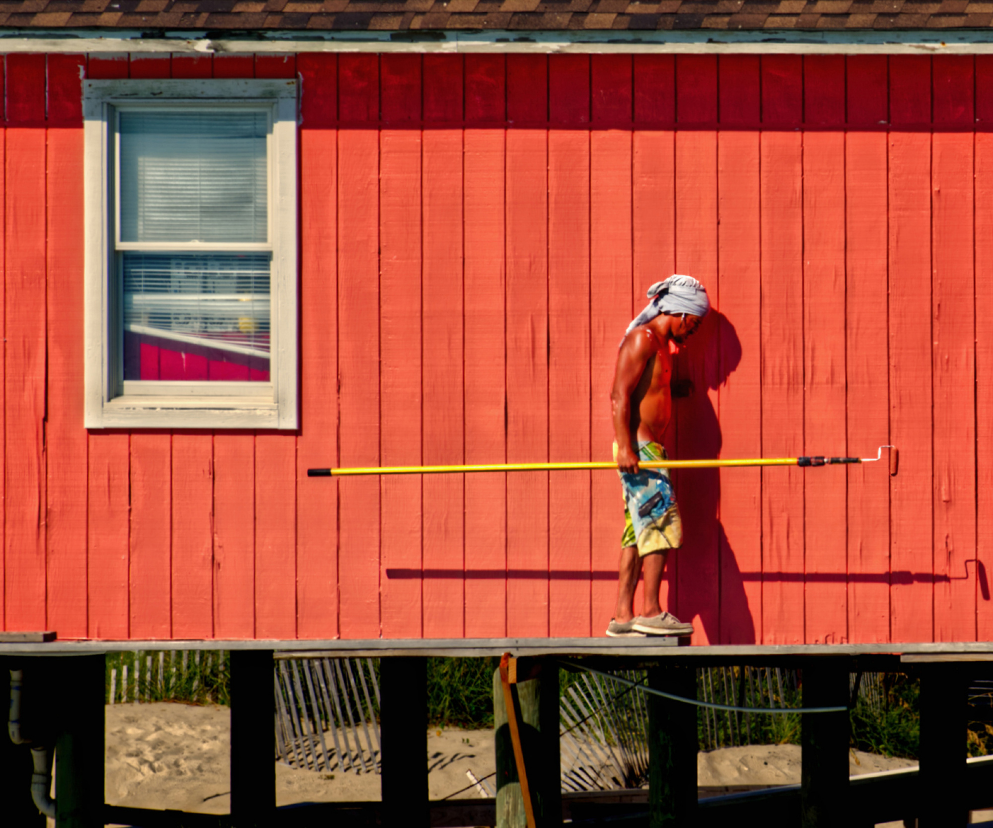
I happened to be fishing about a month ago on a pier located in the Outer Banks of North Carolina and saw this person painting the outside of the pier bait shop. He is actually about twenty-five feet in the air, at the level of the fishing pier. He didn't seem to care much about safety and just painted away. The funny thing is that he kept his paint tray about 15 feet away on a side area of the pier and had to keep waliking back and forth on the small plank walkway he had created. From my standpoint this was a risky venture.
1/500
F11
ISO 200
FL 155
Affinity Photo
I thought this might prove to be an interesting street or documentary type image, so I took my best shot (no pun intended). I was interested in what the critics might say regarding thee photo and ways to improve it.
Thanks in advance for your input.
Best regards, Patrick
Hi Patrick, I like this photo and I do like the bottom part. It adds to the compositon, the risks..the height you speak of, the possible danger of falling. So, I did not crop it off, but look carefully to what I did. You will notice it all over the image. Look everywhere back, front, roof, window, wood pillars, skin, saturation, clarity and texture, look in back at sand, shadows etc. The things that I felt needed improvement I did, especially lowering the saturation and his skin was too orange and dark too. Sometimes I give photography courses. This is how I proceed at times, I want you to train your eye and you tell me what changes I did. I already told you a few, usually I let the photogarpher tell me all. Scan the image with your eyes and look for changes and let me know what you see and where you see them.
Of course I put this wonderful image of yours to my tastes. You may find it too bright, not enough contrast, too much dodging etc. Let me know what you think. Regards. Joe
Joe,
Thanks for taking the time to work on this image. I like what you have done. I believe it makes for a more realistic image. Your colors and tones are more in keeping with what I actually saw at the site. I sometime have a tendency to get carried away with processing. It's kind of like designing a building, you have to know when to stop, or you'll overdo it.
Regarding your specific changes, I obviously see the reduction in saturation and your work on the shadows which added some nice detail. You can actually see the man's left hand against the wall in your version, where in mine the hand is almost invisible. I think those changes help a lot. You have also picked up some nice green in the support columns. Furthermor, it appears you have lightened the window frame, and the man's head covering. I really like the head covering because it draws a focus on the man, who is definitely the subject of this image.
I did not screen shot your image and try to blow it up, so if you made any other more sublte changes, I do not see them.
I'm guessing I did not come close to identify all the changes you made, so I would really appreciate it if you could point them out to me. Also, did you make an overall saturation and lightning change and then work on individual areas, or did you just work on areas incrementally?
As an aside, I'd like to say that I really love this forum and the kind folks, who dedicate their time. I'm not aware of anywhere else on the internet that you can get this type of helpful feedback.
Much Appreciated,
Patrick
Hello again Patrick, glad you like it! Lots to say here. First of all, I do not remember what I did to the photo, so I cannot help you...sorry. Gotcha for a second there right. Bad humor lol. Ok, lets start. Yes, processing, try not to overdo, sometimes keeping it subtle is best. I went into ' pastel ' tones which I prefer. Always make the skin tone the most important when using saturation and vibrance unless you know how to mask and layer to work on all individuallly. But I did not want to go there into layers etc. You presented a fine image and I wanted to show how just using the basic sliders can improve your image. I do not know your level of expertise with Photoshop or LR. so I wanted to keep this simple. Yes saturation and vibrance down each about -10 for full image. For full image I increased clarity and texture about +7 each. His skin just dodging shadows, yes his hand and his overall shadow on wall. Yes the head covering and yes the window blinds and frame. Yes the pillars below, removed shadows and sharpened too, increased a few highlights too. The sand, wooden fence and grass in the background were given a dodge boost. On the roof, the light coloured tiles were give a boost of dodge, adds texture, slight boost of sharpness. The mans body of course I gave more light, his face too, just using dodge shadows / highlights / mid tones. That is about it. Your composition of sense of height, risks and place remains intact, it was what you felt you wanted to convey..and a very good image, and I gave a color tone that is pleasurable to look at. Oh yes I reduced slightly contrast. Oh yes, I also dehazed very slighted to remove overall contrast and shadows. Hope this helps. Joe
Thanks Joe, I really appreciate your effort. Best regards, Patrick
